|
|
Post by clemon on Feb 23, 2013 20:53:33 GMT
Post art/stories/web-design/what-have-you here for suggestions OR/AND critique (requester could specify). Or, make requests for feedback based on specific things. : ) WIP Suggestions:When you want suggestions on how to build on what you have so far. The idea is that you've already done work on the WIP and don't have the time/resources/effort to undo what you've already done, but would like some advice on what be added to it. e.g. Hey guys, what do you think I should do with my avatar?WIP Suggestion: Add a frame around it because frames make everything 500% cooler!Critique:When you want suggestions on how to improve on your WIP or what you ought to do in the future. In this idea, you've done work but are more able to change/undo what you've done or apply the critique to future pieces that are similar. e.g. Hey guys, what do you think I should do with my avatar?Critique: You should change the lemon to an apple. Lemons are sour. Also change the red to blue, because red reminds people of blood too much.========================= 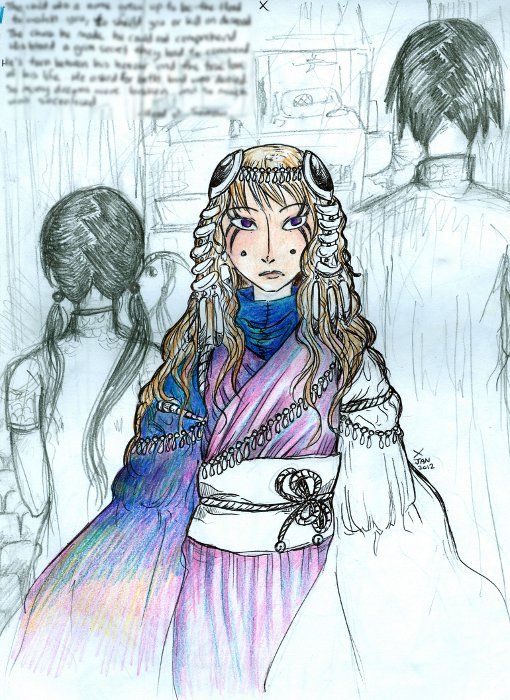 Looking for Suggestions. I'm trying to colour this girl's outfit, but I can't seem to come up with a good colour scheme (notice the yellow + blue + pink + purple + dark blue on the sleeve). Blues and purple-pinks are what's been done so far, but can anyone suggest other colours to be added and where they should be added? Or is it unsalvageable? |
|
|
|
Post by Margo on Feb 25, 2013 1:14:58 GMT
Ok I'll bite, I think you've got enough colours here that actually work really well together. You just need to keep colouring... 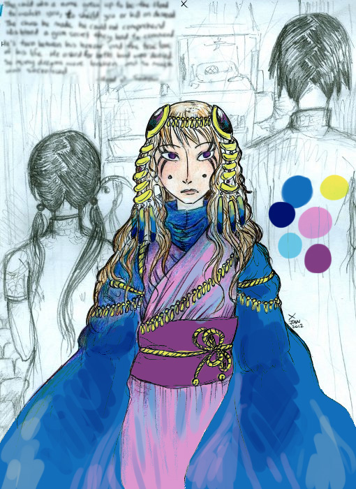 |
|
|
|
Post by Soff on Feb 26, 2013 15:35:43 GMT
I agree with Margo. The colors you have look very pretty. Unless there's some reason for you to completely change the color scheme, it seems to work very nicely. (By "some reason" I mean something to do with the character, that you think now that these colors don't fit her for some reason).
|
|
|
|
Post by clemon on Mar 4, 2013 17:58:04 GMT
The only thing I have "against" the blue is how it makes her look like she's got hidden super secrets of great significance. Very regal. Does blue signify anything else?
Her character is actually pretty shy and helpless, but I guess she's making the ol' serious face here, so you probably can't tell.
|
|
|
|
Post by Soff on Mar 5, 2013 4:57:16 GMT
Yep, she does look kinda queen-like like that. Umh... I see. Maybe white? I'm not sure how would you do that... Maybe you could go for a lighter shade of blue or maybe even grey? Or for something completely different, maybe you could go for a brown/green-ish palette to make her look a bit more toned down (do you have more copies of the drawing?). I don't know. I suck at palettes...! I just throw colors at drawings and hope for the best  . |
|
|
|
Post by Margo on Mar 5, 2013 5:19:46 GMT
since when does blue mean secrets?? That blue = virgin mary = femininity, purity, delicacy, and all those other things associated with ladies before pink took over as the girly colour of choice. Cobalt blue, which that colour roughly is, is also a favourite for skies and porcelain, so sayeth Wikipedia. or you could swap the blue of the sleeves w/ the purple of the belt, but that would be even more 'regal', purple being THE royal colour. |
|
|
|
Post by mareofnight on Mar 5, 2013 20:43:10 GMT
If it's not too late, I'd say just go for a paler, maybe greener shade of blue. Baby blue would come off as much less royal.
|
|
|
|
Post by clemon on Mar 7, 2013 14:49:30 GMT
@ Margo: I think that blue is a very authoritative that is supposed to be calming and attractive (as oppose to red, which is exciting and attractive). Darker blues and purples sort of up the authority. I suppose I could up the lightness of the blue, as suggested by Soff. @ mareofnight: Pale might be key. The problem with using a greener shade of blue, is that I've already got a character who usually wears blue-green and a running motif of the colour. :I I just throw colors at drawings and hope for the best . Yes!...I usually do this, and then cover it which shading of purple or dark blue + layer of colour to make the colours more unifying. :I |
|
|
|
Post by Margo on Mar 10, 2013 0:26:55 GMT
Eh, I still think she needs the medium blue to tie her together--I was just continuing what you started, anyway. If you go with the lighter blue there won't be enough contrast in the colour scheme. Plus, I don't think those coloured pencils erase very well. You could do a gradient from top to bottom, cobalt to sky blue.
If you want an "authoritative" blue (still don't really get what you mean by that), I guess there's navy blue, which is mach darker than what you've got there.
|
|
|
|
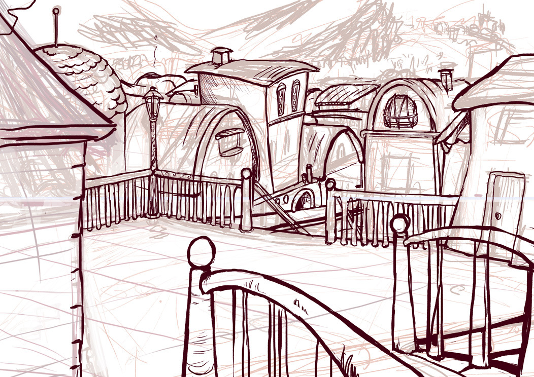
Post by Soff on Apr 21, 2013 4:24:40 GMT
 I'm doing this thing on and off for fun, but since it's taking so long I figured I could ask if anyone sees anything to off about the perspective? (Or anything, really... I'm being nitpicky for fun, so feel free to point anything out) Fun fact: the only subject I failed at high school was technical drawing. |
|
|
|
Post by clemon on Apr 25, 2013 1:10:40 GMT
Hmmm...From looking any your perspective... 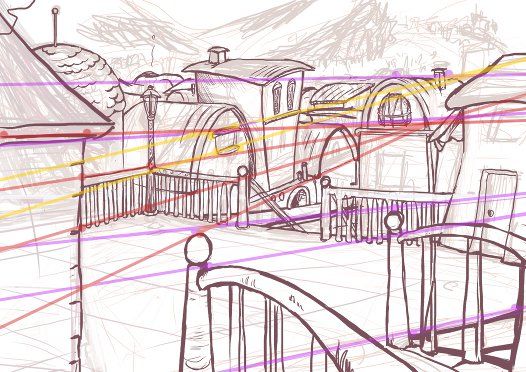 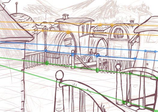 There seem to be multiple points of perspective thingys? (Can someone back me up or turn me down on this one; I know more about Superboy than perspective.) Which means that your town is thus full of different shaped buildings (which can be a good thing depending on your setting)...? |
|
|
|
Post by Soff on Apr 25, 2013 3:56:40 GMT
There are supposed to be multiple levels, but... yeah, the perspecitve is really confusing. That's why I wanted to verify. And, yeah, differently shaped buildings is kinda what I was going for, but... I still have to work a lot with city-like stuff.
|
|
|
|
Post by elczenius on Apr 25, 2013 23:28:33 GMT
I'm not sure what your process is for backgrounds, but I find it a lot easier to make my perspective grid/points and draw a bunch of boxes... and then turn the boxes into buildings~ Then even if they're shaped differently, you have the base perspective in the box beneath and you won't stray too far.
|
|
|
|
Post by clemon on Apr 27, 2013 23:32:30 GMT
That sounds like a good idea, elcy!
Or you could take me route and avoid background shots or ignore perspective altogether. >_>
I think the other alternative is to trace actual photographs, but I hear that's ... problematic in some cases.
|
|
|
|
Post by Soff on Apr 28, 2013 18:06:10 GMT
I actually do the boxes thing! It's just that some of the sketch lines and my incapacity to keep lines straight in a the direction they should go while trying to render stuff makes the perspective look even more skewed than it originally was. Not to say that I manage perspective well at all! I'm trying to figure out how to put together more than a single plane here and it's way more than I can chew. I should should stick practice my prespective skills with a single plane to get a better grasp of it, before getting myself into harder stuff, but... where's the fun in doing stuff I might even manage to do right ;P.
And yeah, tracing photograhps... I think I'd benefit a lot from doing any kind of studies that draw from life (even if it's photos), but I have a hard time concentrating into that kind of stuff. I'll show you guys how this continues!
Avoiding backgrounds wouldn't be a solution because I actually really like doing them! I just... need to get better at making them readable ;D. And ignoring perspective you can get awesome results (the friend I have the tumblr with is into children's book type of illustration, and does some lovely stuff like that), but I really want to figure it out. I love environments and I really want to feel able to describe them, at least a bit.
|
|
|
|
Post by elczenius on Apr 30, 2013 15:36:17 GMT
"my incapacity to keep lines straight in a the direction they should go" ...ruler? >.> I don't really like his characters, but this guy's got some solid foundations, and his background tuts really helped me out: - 1-point persp.- 2-point persp. - 3-point persp.Even just watching him progress from boxes to background really helped me to see how to utilize simple blocks/lines. |
|
|
|
Post by Soff on May 1, 2013 17:35:59 GMT
Thanks Elczy! Wacthing how people apply the rules always helps understanding a little better  . If I could use properly a ruler, I wouldn't have failed technical drawing! . The other fun fact is that I actually explained some of my school friends how the thing was done, so my problem wasn't... lack of understanding. I just could not execute it in such a way that my professor found it acceptable. I do things like sliding the rule into a different position and noticing it after I made some very hard to erase line (do you call it "heavy hands" in English, too?). Around the third time you do this, you end up with something that's basically insalvageable. Something kinda like that happens with ctrl click with the tablet, too, except I can still erase. I'll ask you guys for extra help when I actually sit down and draw some more perspective-y stuff. Thanks a lot, though . |
|
|
|
Post by mareofnight on Jun 12, 2013 2:22:27 GMT
I don't have an actual WIP shot to share, but I need help on a project and I don't think it deserves its own thread. I'm trying to color the white and ivory varieties of this fake fur to have a black backing, while keeping the furry bits white or mostly white. (It's alright if the fur ends up with dark "roots".) Coloring the backing with a sharpie gets sort of the effect I want, but I'm worried the sharpie would bleed or fade after a while, especially if it were put through the wash. (It doesn't absolutely need to be washable, but there's some risk of it getting wet in transit to the person I'm making it for.) I'm going for a magical, starry sort of effect, if that makes any sense... trying to make bits of white fur on a dark field. The fabric already has some shine to it, and I was hoping a black backing would make it stand out more. (I'm making a stuffed animal of a magical critter.) Would the sharpie hold up to cuddling and getting wet? Do you know of any better ways to get this sort of coloration? |
|
|
|
Post by Emily on Jun 12, 2013 13:14:28 GMT
I have seen people use sharpie for fur colouring, but it can come off yes, especially if the fiber is synthetic....
|
|
|
|
Post by mareofnight on Jun 12, 2013 21:48:07 GMT
Hmmm. I'll look into inks that are meant to go on synthetic fabric, then. (I tried rubbing the fabric I tested it on, and the sharpie does come off a bit.)
|
|


 .
.
 .
. 